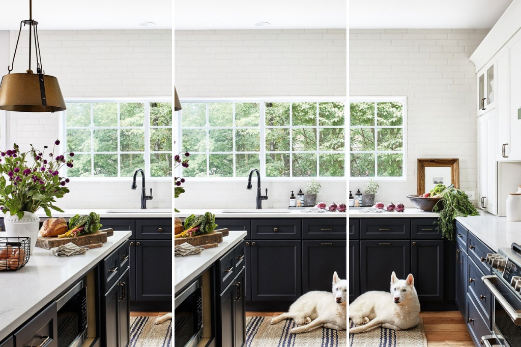
This post will show you 16 absolutely stunning before and after kitchen remodel ideas you will fall in love with!
This post may contain affiliate links, which means I’ll receive a commission if you purchase through my link, at no extra cost to you.
If there is one room in your entire house that should always be styled and functional, that would be the kitchen. It’s the heart of the home so it’s absolutely essential that it looks amazing all the time.
If you’re looking for kitchen remodel ideas, this post is for you. Whether you like the modern look with all-white kitchen hardware or something with a pop of color, we’ve got it all here. Keep on reading for 16 of the most stunning before and after kitchen remodel ideas that’ll leave you speechless.
Pin for Later

BEFORE AND AFTER KITCHEN REMODEL IDEAS:
1. BEFORE: OUTDATED KITCHEN WITH GRANITE
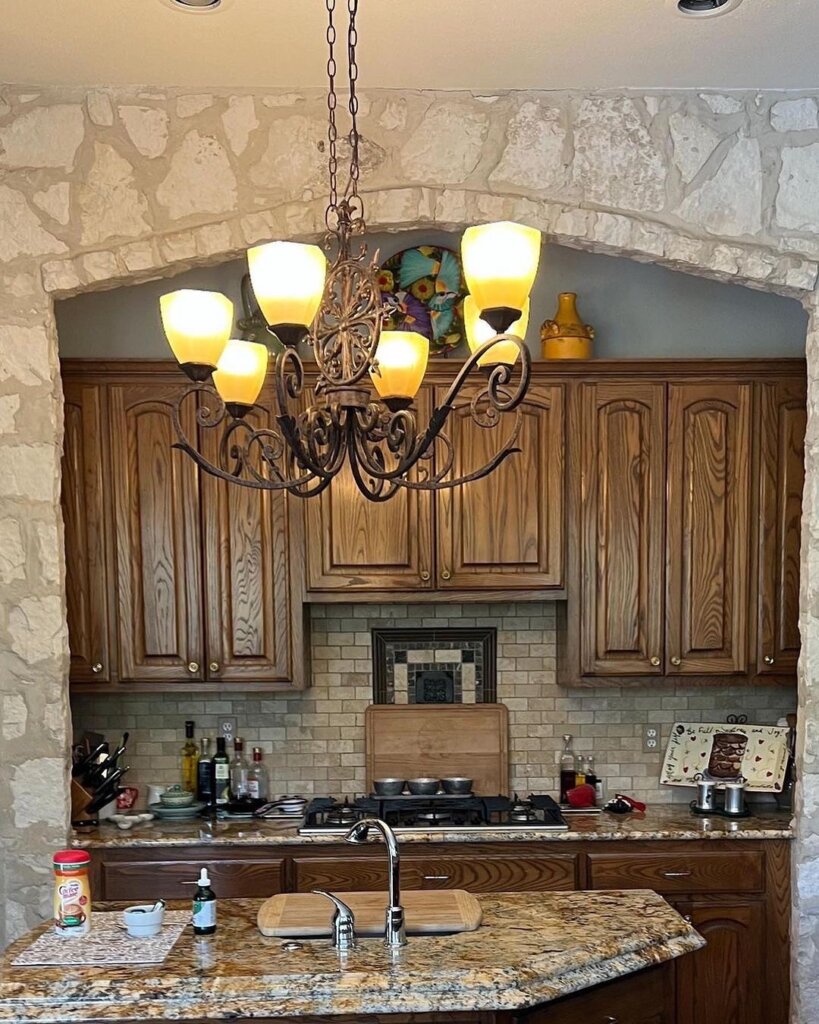
This before picture of the kitchen looks very outdated and old. The granite doesn’t complement the overall look of the kitchen and it looks very cramped and cluttered.
Though there is a decent amount of counter space and cabinets, the space isn’t very organized. Now, hold on to your hats because the after result will leave you speechless!
AFTER: GORGEOUS KITCHEN WITH ADDED STORAGE
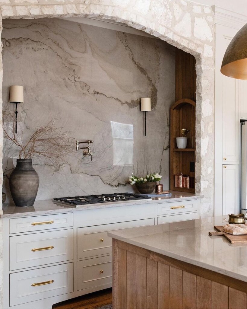
How beautiful is the result? I am seriously in love with this kitchen. I love how they kept the arch-like design while making it more modern.
The combination of the cabinetry and the stunning backsplash just brings the whole aesthetic together.
2. BEFORE: CRAMPED KITCHEN
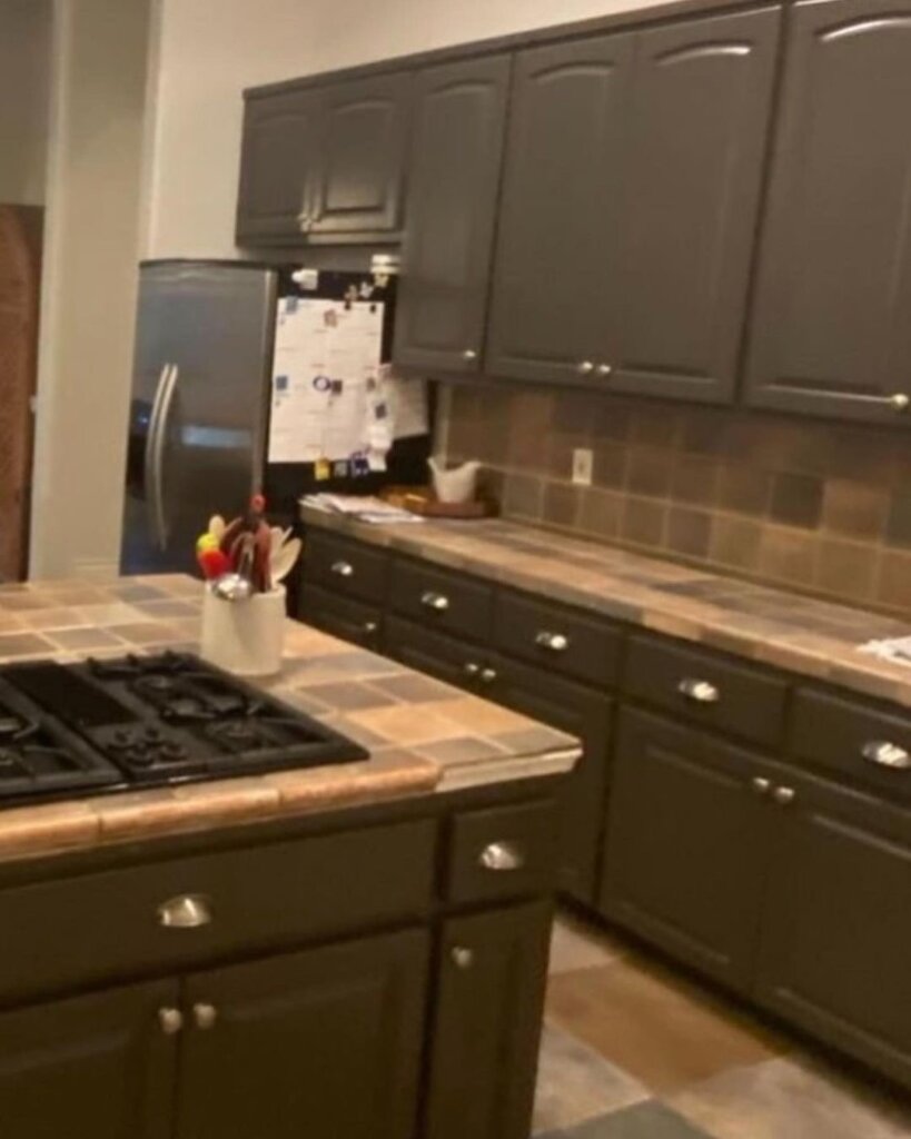
Prior to the renovation, this kitchen was very cramped with old and dingy tiles that made the kitchen look out of date.
The stove was inconveniently placed, and there was very little space to work with.
AFTER: MODERN KITCHEN WITH WALL SHELVES
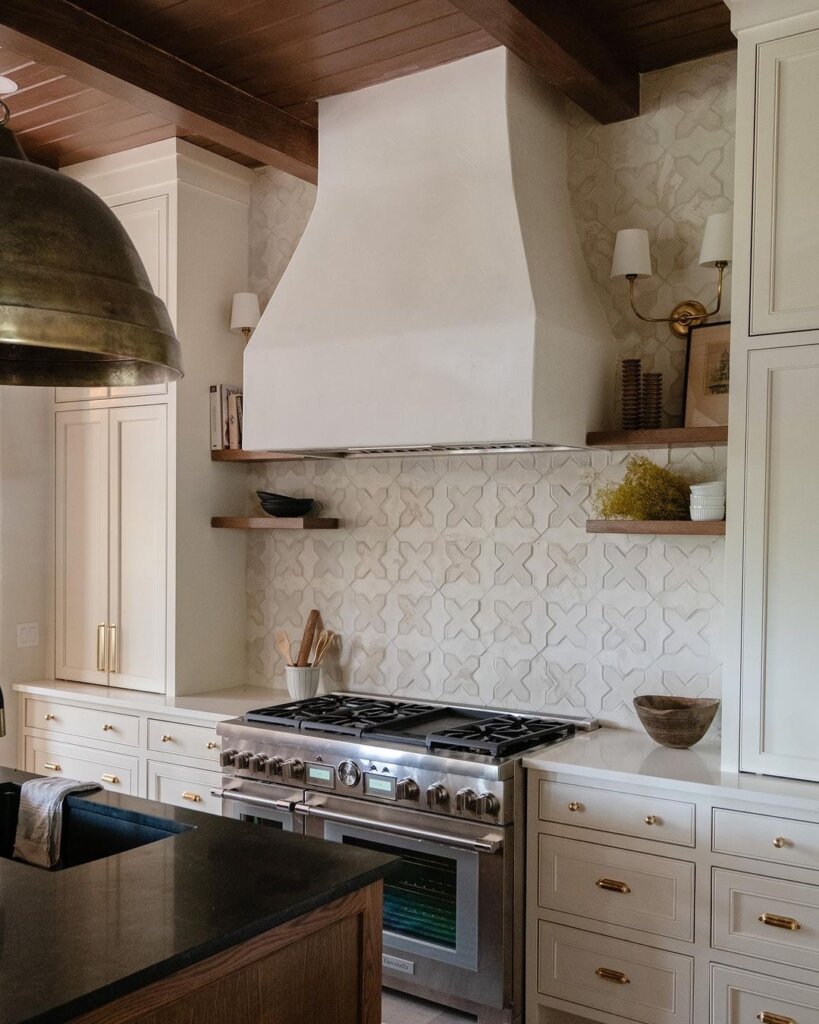
First things first, can I just say how gorgeous the kitchen backsplash is? They did such an amazing job with the renovation. There are so many upgrades in this kitchen.
The wall shelves, cabinets, drawers, and the island come together so nicely.
3. BEFORE: SPACIOUS KITCHEN WITH ALL WHITE CABINETS
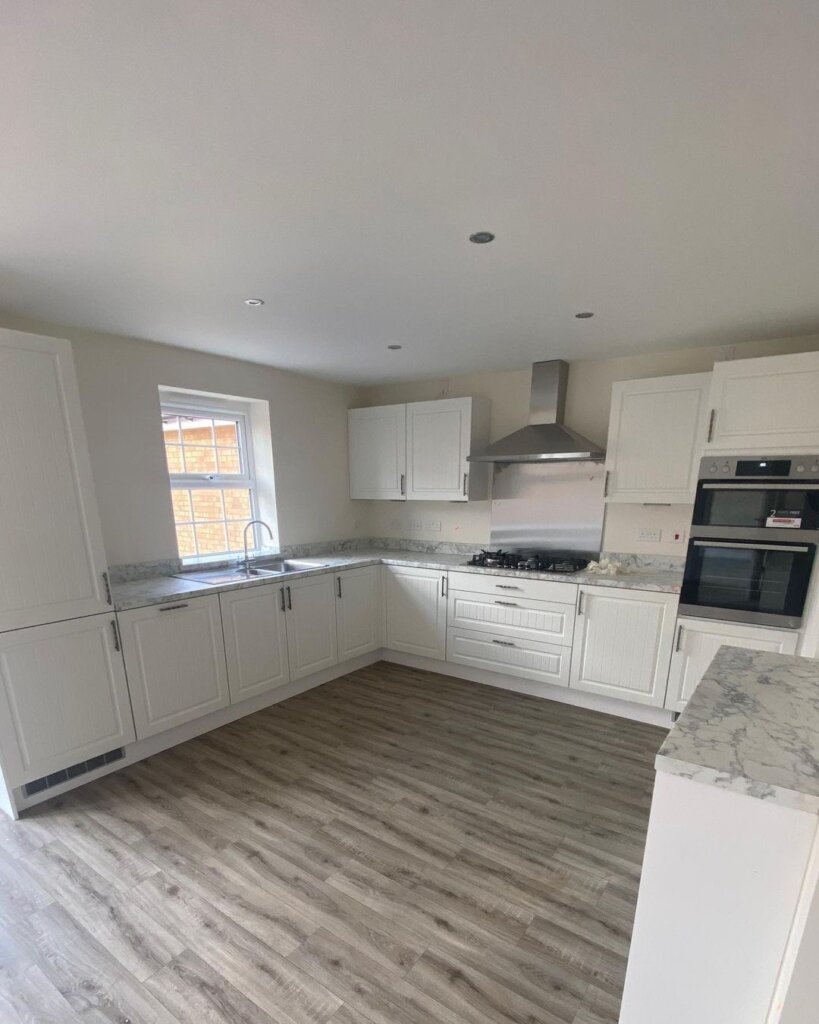
This kitchen is honestly not that bad. The cabinets are fine, it’s very spacious, but it’s lacking a bit of color and personality.
AFTER: KITCHEN WITH PERSONALITY
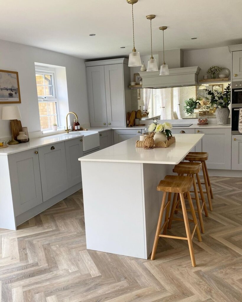
The after-renovation results are stunning. The added kitchen island in the middle makes the space feel a lot less empty. They also changed the color of the cabinetry which makes the kitchen look less bland.
The added stools, the overhead lighting, and the decor are all great additions to the room.
4. BEFORE: THE BARE MINIMUM
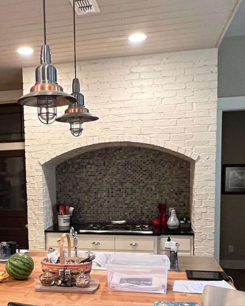
The stone wall and tiles are very lackluster and make the kitchen look old.
Before the renovation, the kitchen featured a wooden island and outdated light pendants that didn’t bring much to the table.
AFTER: BEAUTIFUL KITCHEN WITH LITTLE UPDATES
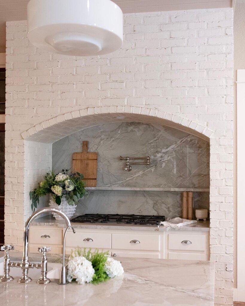
The results of the renovation are stunning. The kitchen looks SO much better with a lot of little upgrades being made. The backsplash for one definitely brighten up the room.
I’m glad they decided to keep the stone wall, it’s very unique and looks fantastic. They also replaced the wood on the kitchen island with marble, which definitely changed up the whole look.
5. BEFORE: FEATURELESS KITCHEN
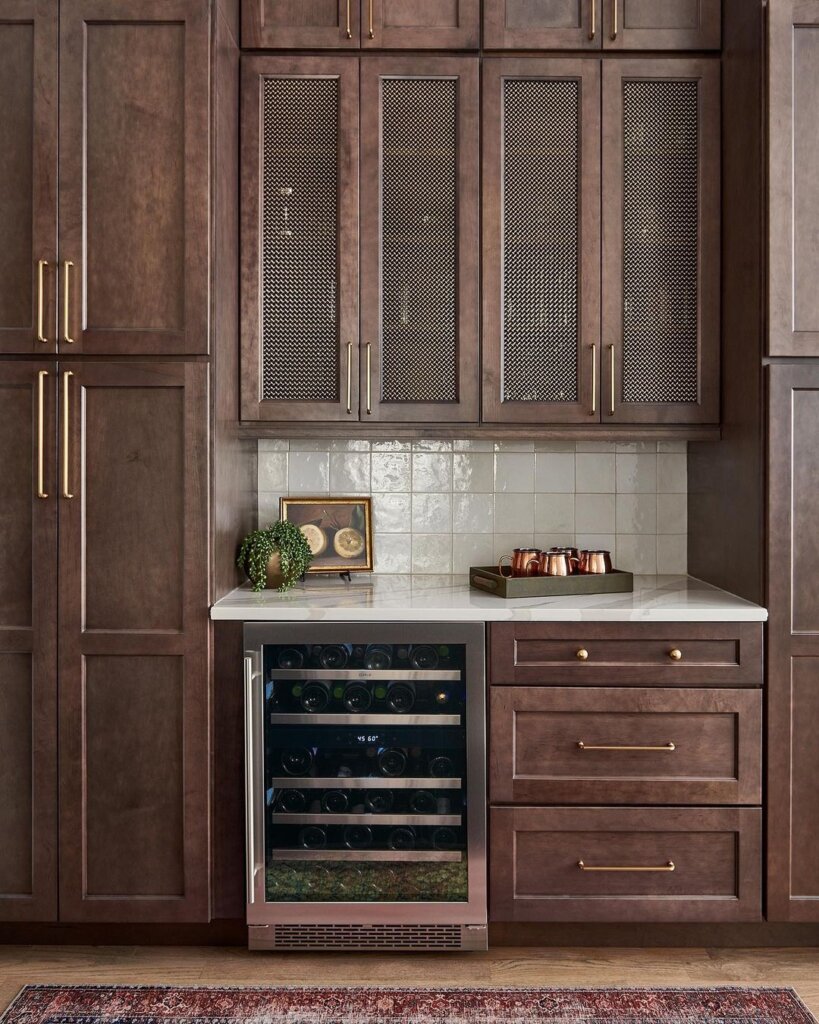
Prior to the renovation, the kitchen featured old cabinets with outdated wood and a little wine cooler. This kitchen gives a very rustic and vintage look.
I know a lot of people who love this design style but it may not be everyone’s cup of tea.
AFTER: LIGHT AND BRIGHT
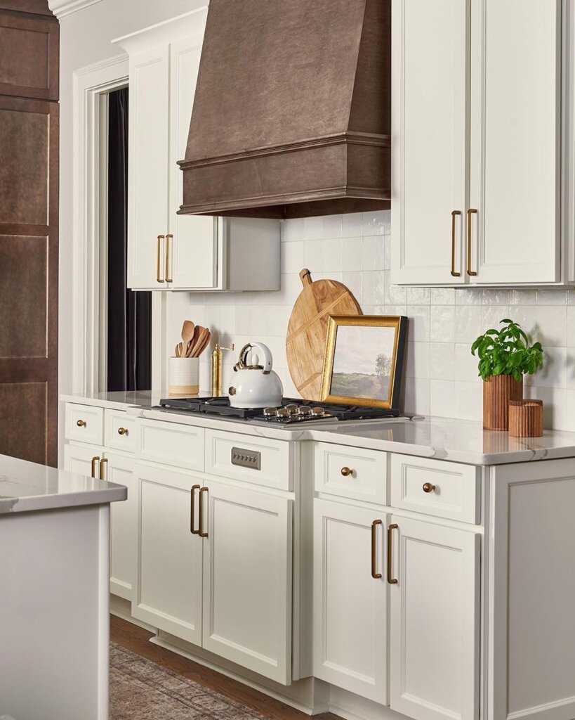
Combining the rustic design with bright and light kitchen cabinets really opens up the space and makes it feel more sophisticated.
Before the kitchen was very dark and dull, now it’s very bright and organized, almost like a breath of fresh air.
6. BEFORE: DATED KITCHEN WITH DINGY CABINETS
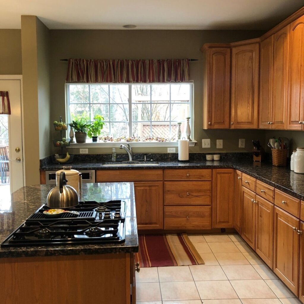
This kitchen looks very old, especially with the cabinet colors and the floor tiles. The kitchen is the heart of our home so it’s important that it looks its best.
The renovation results are truly mind-boggling and very hard to believe it’s the same kitchen.
AFTER: OPEN AND AIRY KITCHEN WITH BLUE CABINETS
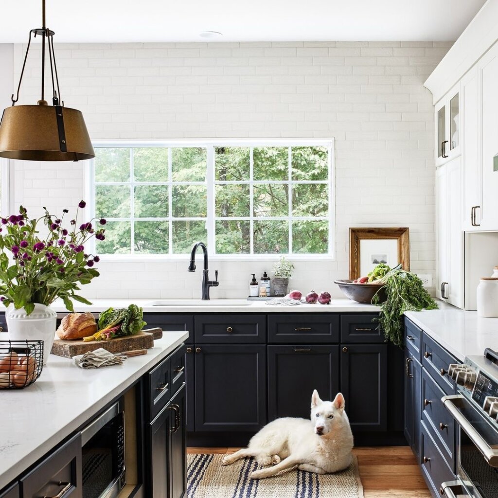
Who’s tired of all-white kitchen designs? If I’m being honest, I could never tire of all-white kitchens but this renovation result is truly inspirational.
Take a look at just the window. It’s hard to believe that it’s the exact same window, isn’t it? It looks so different and bright.
The blue kitchen cabinets add a sense of depth and personality to the room. I love how the design completely transformed the space to be more open and airy.
7. OUTDATED KITCHEN WITH DULL WALLS
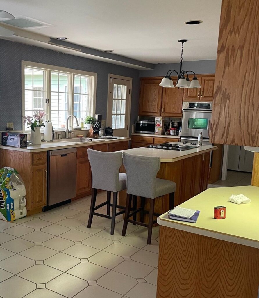
The layout of this kitchen is great as it is, but it could definitely use an upgrade. It needs more overhead lighting and different materials for the cabinets.
This kitchen also needs more counter space to work with.
AFTER: MODERN KITCHEN WITH GOLD ACCENTS
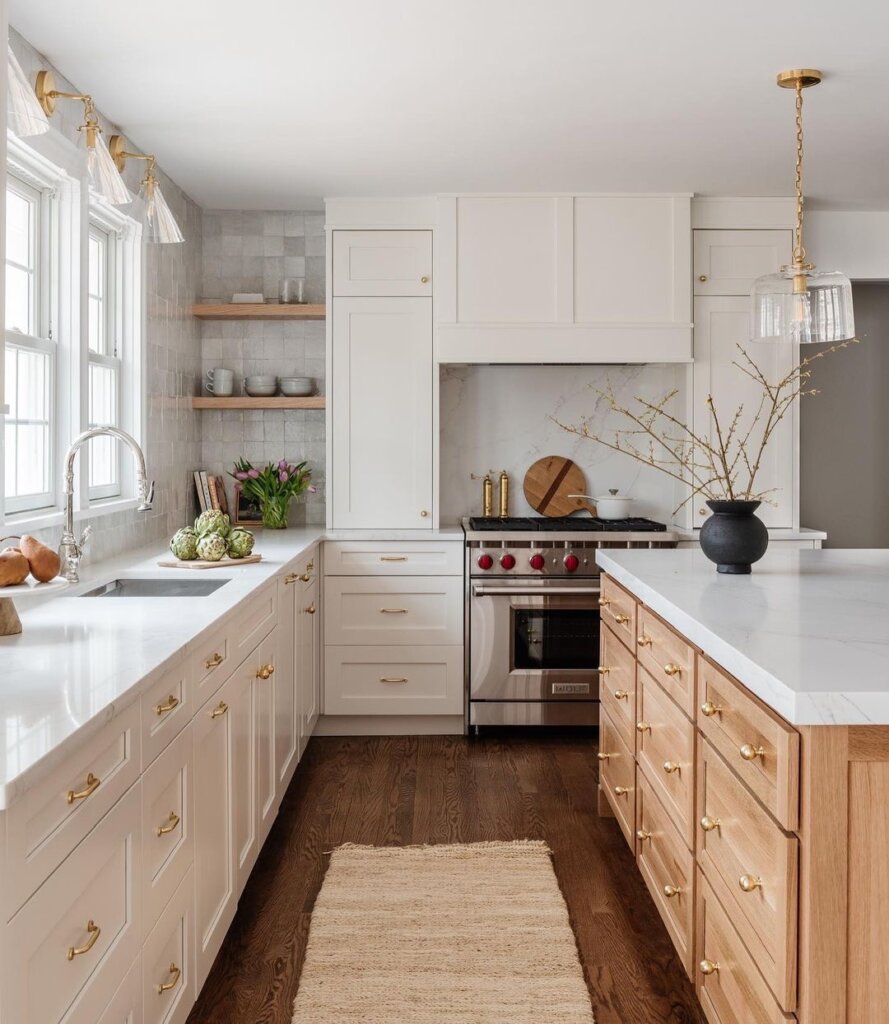
The after-renovation result is absolutely stunning. They removed the door to create more counter space. The gold accents on the cabinets complement the whole design really well.
They also replaced the floor tiles with stained wood which looks amazing. Instead of painting the walls a different color, they opted for gorgeous backsplash.
8. BEFORE: LACKLUSTER AND CRAMPED
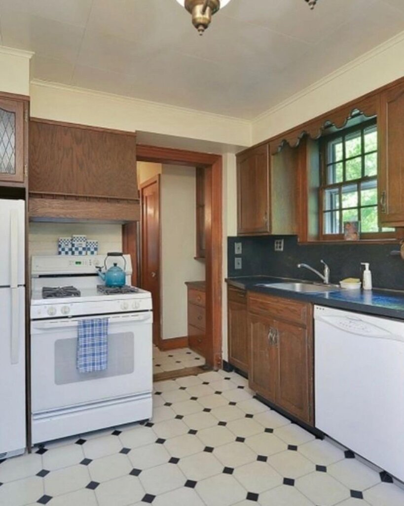
This kitchen is very lackluster and dated. It looks aged and is very cramped. The tiles clash with literally everything else that’s going on and are in desperate need of an upgrade.
AFTER: BEAUTIFUL AND FUNCTIONAL KITCHEN
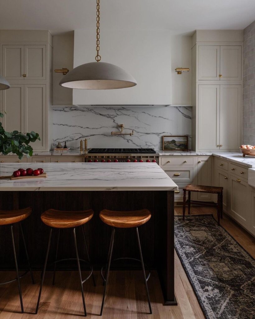
The natural light in this kitchen is just phenomenal. Every corner of this kitchen is full of details that make this kitchen so beautiful and airy.
I see white oak wood floors in SO many homes and for good reason. They look stunning and go with every type of kitchen.
9. BEFORE: WOOD ON WOOD KITCHEN
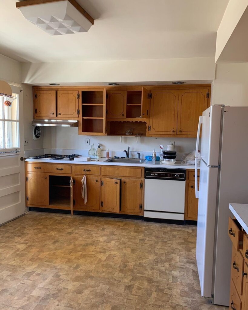
While this kitchen was very spacious with lots of storage space, the all-wood cabinets aren’t adding anything to the room.
AFTER: LIGHT BLUE CABINETS WITH ADDED WALL SHELVES
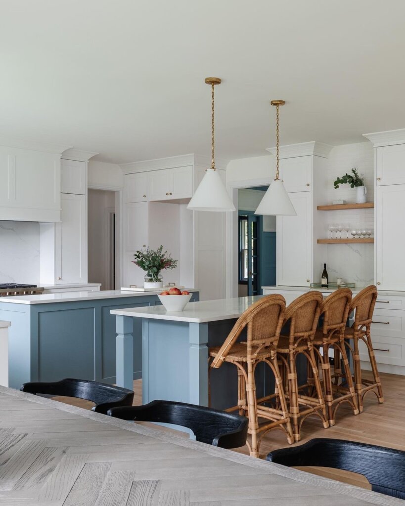
What a transformation. The before and after kitchen remodel is stunning. That’s right people, light blue cabinets are all the rage right now. They look so good and add so much personality.
Everything in this kitchen, from the ceiling to the floors is simply immaculate. it’s hard to believe this is the same kitchen but it is!
The wall shelves for organization and decor, the white oak floors, the added kitchen islands, and overhead pendant lighting make the space feel truly special.
10. BEFORE: PLAIN KITCHEN
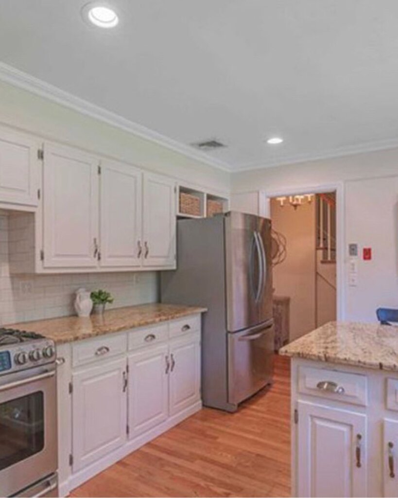
Before the renovation, the kitchen was functional but definitely needed upgrades in the material they used and the overall layout of the room.
AFTER: LUXURY KITCHEN WITH GOLD ACCENTS
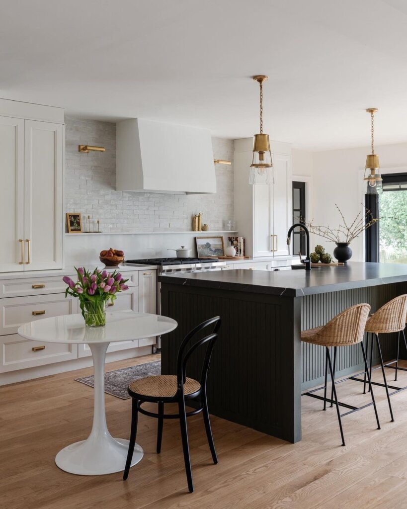
These before and after kitchen remodel ideas are always SO good they leave me shocked! This kitchen just screams luxury and elegance. They did such a good job.
The black kitchen island combines perfectly with the gold accents. The kitchen backsplash is gorgeous and that wall shelf they added is amazing for putting your salt and pepper, and all other seasoning on there.
11. BEFORE: FEATURELESS DATED KITCHEN
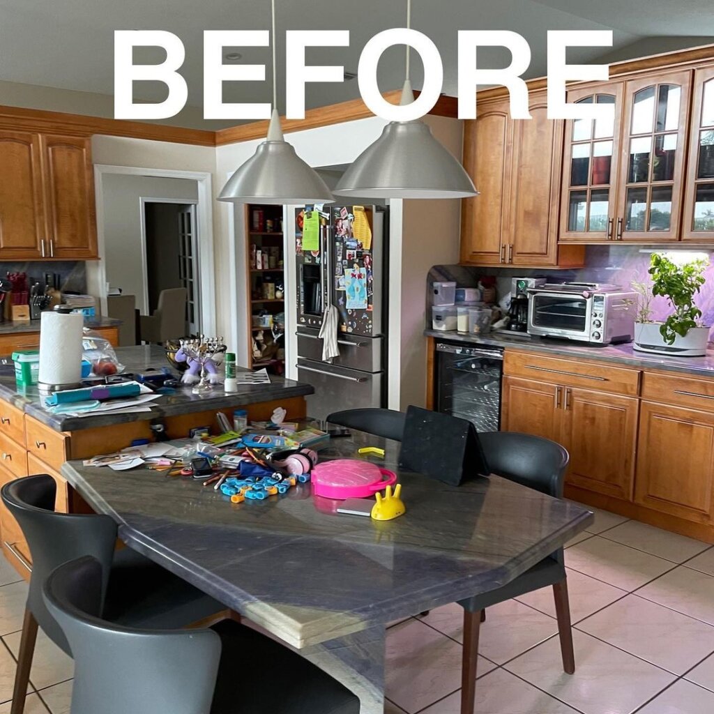
Prior to the renovation, the kitchen featured old tile floors with dated wood cabinets. The kitchen is also very disorganized and cluttered which makes it look cramped and small.
AFTER: NEUTRAL MODERN KITCHEN
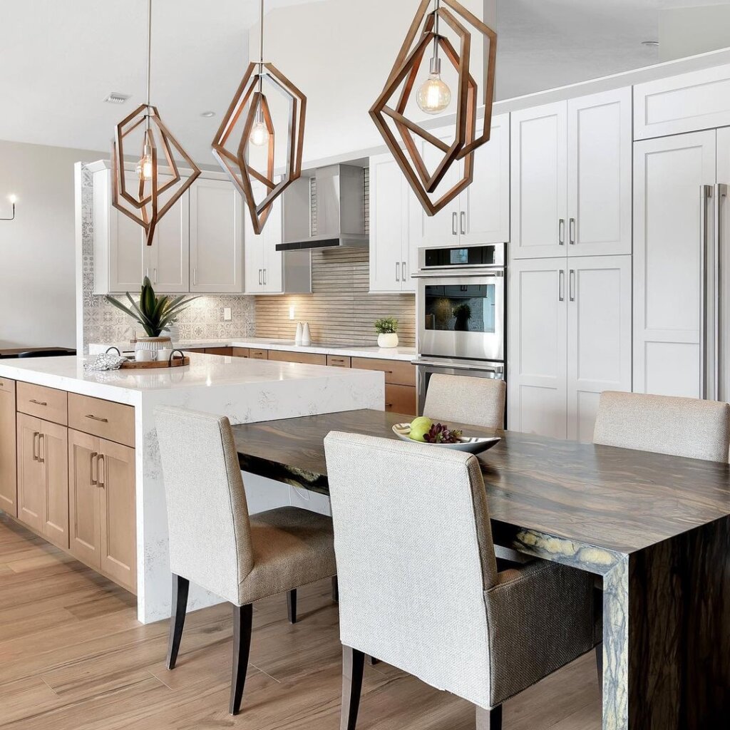
The open minimal and modern kitchen features gorgeous white oak wood floors and luxurious pendant lighting. The hidden fridge is amazing and goes perfectly combined with the cabinets.
I also love the little area with the dining table and chairs. It coordinates perfectly with the overall aesthetic of the kitchen.
12. BEFORE: NEEDS AN UPDATE
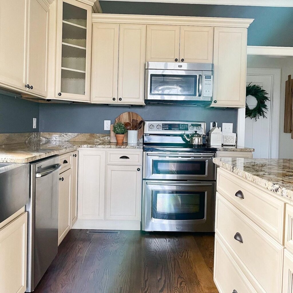
This kitchen is very underwhelming. The colors and the countertop definitely need a refresh. The wood floors especially make the room feel dark and dated.
AFTER: CLASSY KITCHEN REMODEL
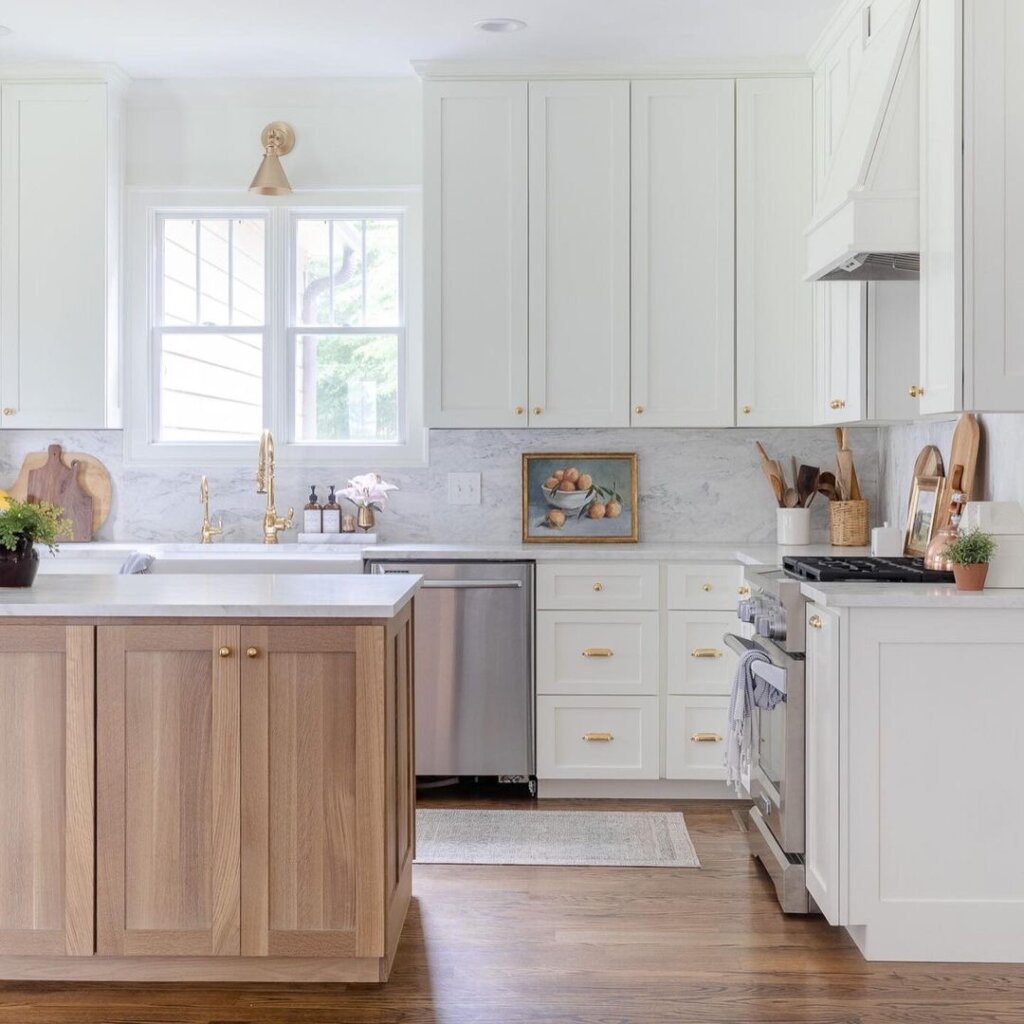
The gold knobs look so luxurious and classy. I am so in awe of this kitchen. From the marble countertop and backsplash to the brass accents, oak floors, and island cabinets.
Everything goes together so perfectly. White kitchens are like the little black dress of interior design, they never go out of style!
13. BEFORE: BORING OUTDATED KITCHEN
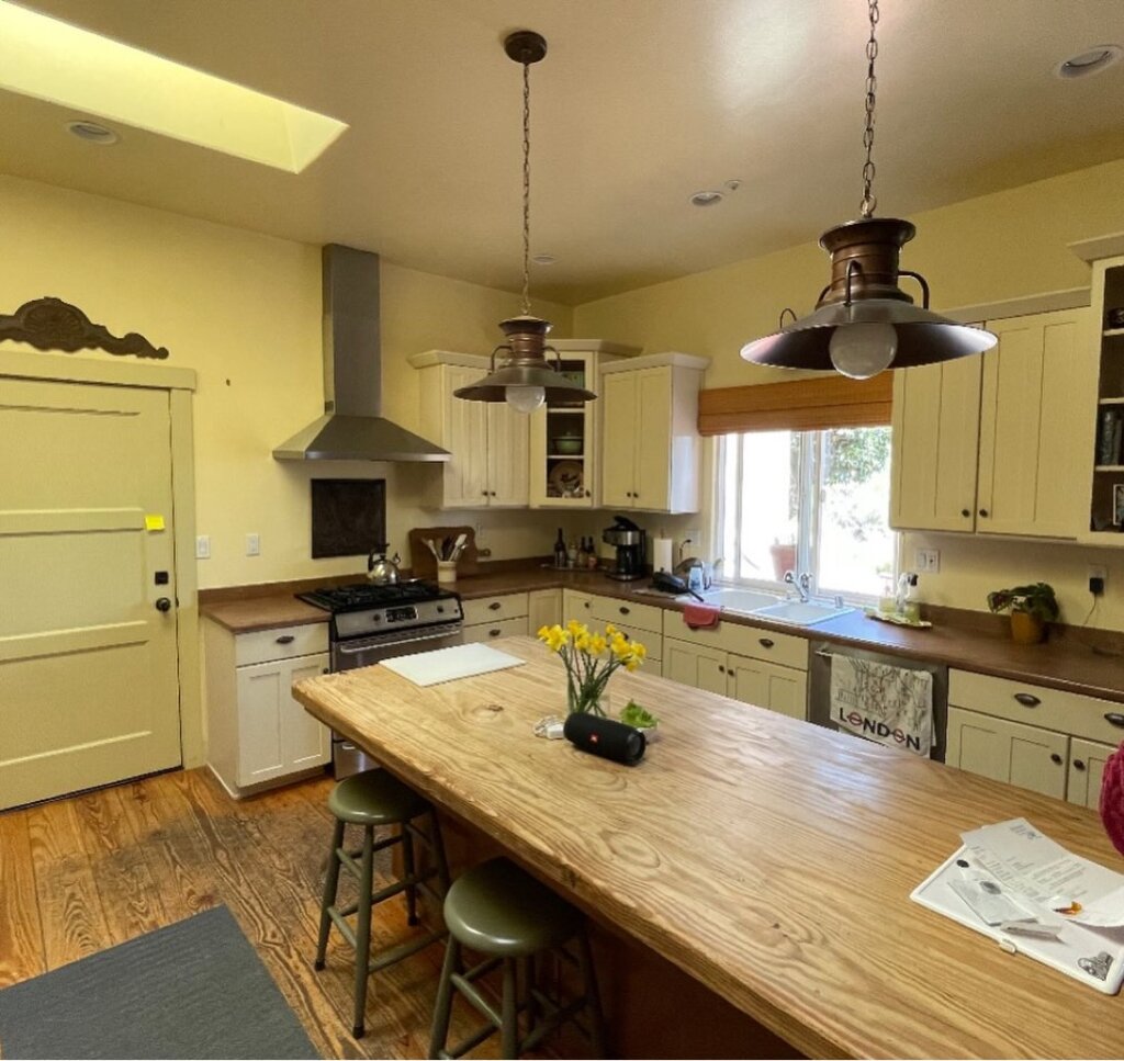
Before the renovation, this old kitchen was in desperate need of a facelift. From those cabinets, lighting, and stove, down to the floors.
AFTER: KITCHEN REMODEL WITH A POP OF COLOR
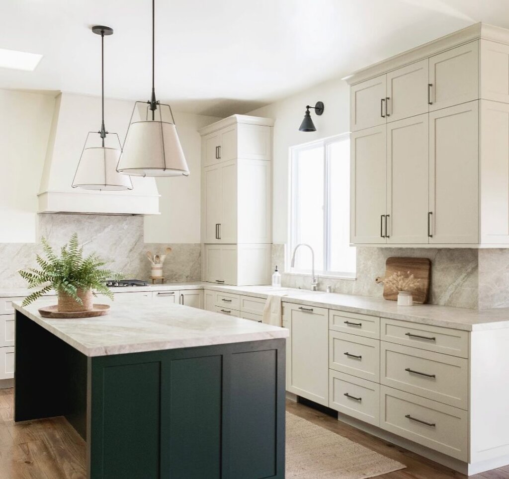
If you like to have a pop of color in your kitchen, this one’s for you. The green paint on the kitchen island looks outrageously gorgeous and looks so bright in the all-white kitchen.
This kitchen definitely had a huge makeover. There are a lot more drawers added which is great for storage. There is also an appliance garage hiding station which is awesome for storing things like toasters and coffee makers.
The designers made sure to make plenty of storage space for their clients. The backsplash and the countertops are so elegant and classy.
14. BEFORE: VERY DULL KITCHEN
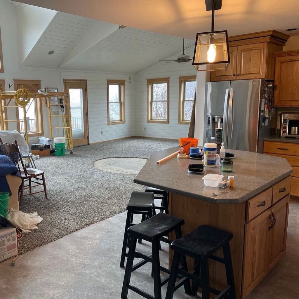
You don’t need to be an interior designer to know that this kitchen is in desperate need of a makeover. There was hardly any room for cooking and the island was very funky looking.
It also needs more overhead lighting than just one pendent.
AFTER: OPEN KITCHEN WITH LOTS OF STORAGE
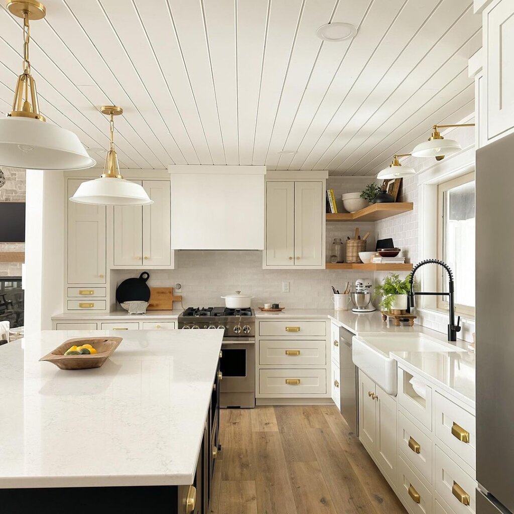
This kitchen remodel is stunning. It went through SO many changes.
They added more lighting and brass drawer hardware pulls. Redid the floors, added shelves for storage and decor, the paint, the stove, the island, and the fridge.
I am literally left speechless from looking at this kitchen. It’s SO GORGEOUS!!
15. BEFORE: LIFELESS KITCHEN
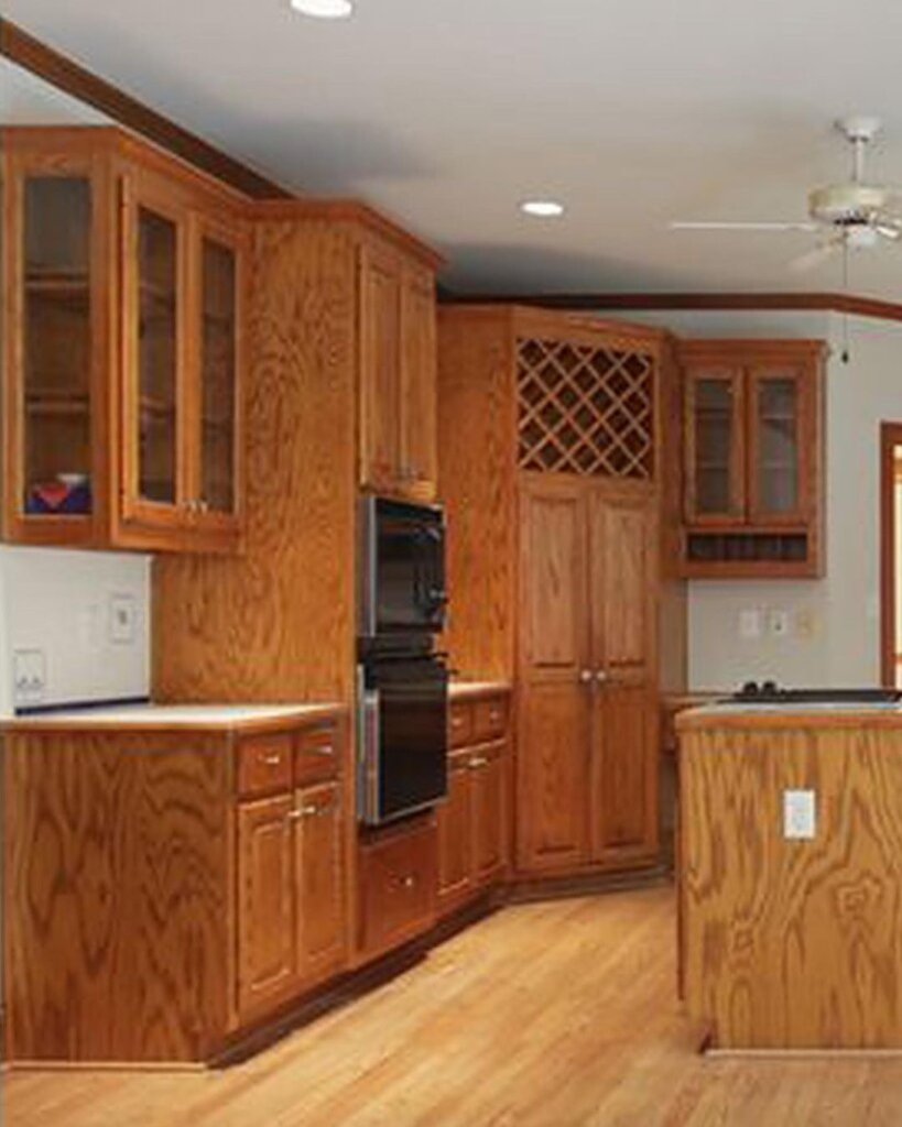
Before the renovation, this kitchen looked so dull and lackluster. There was barely any counter space for cooking. Also, not enough kitchen cabinetry to store all of the essentials.
This kitchen needed to be modernized ASAP!
AFTER: BEAUTIFUL AND BLUE
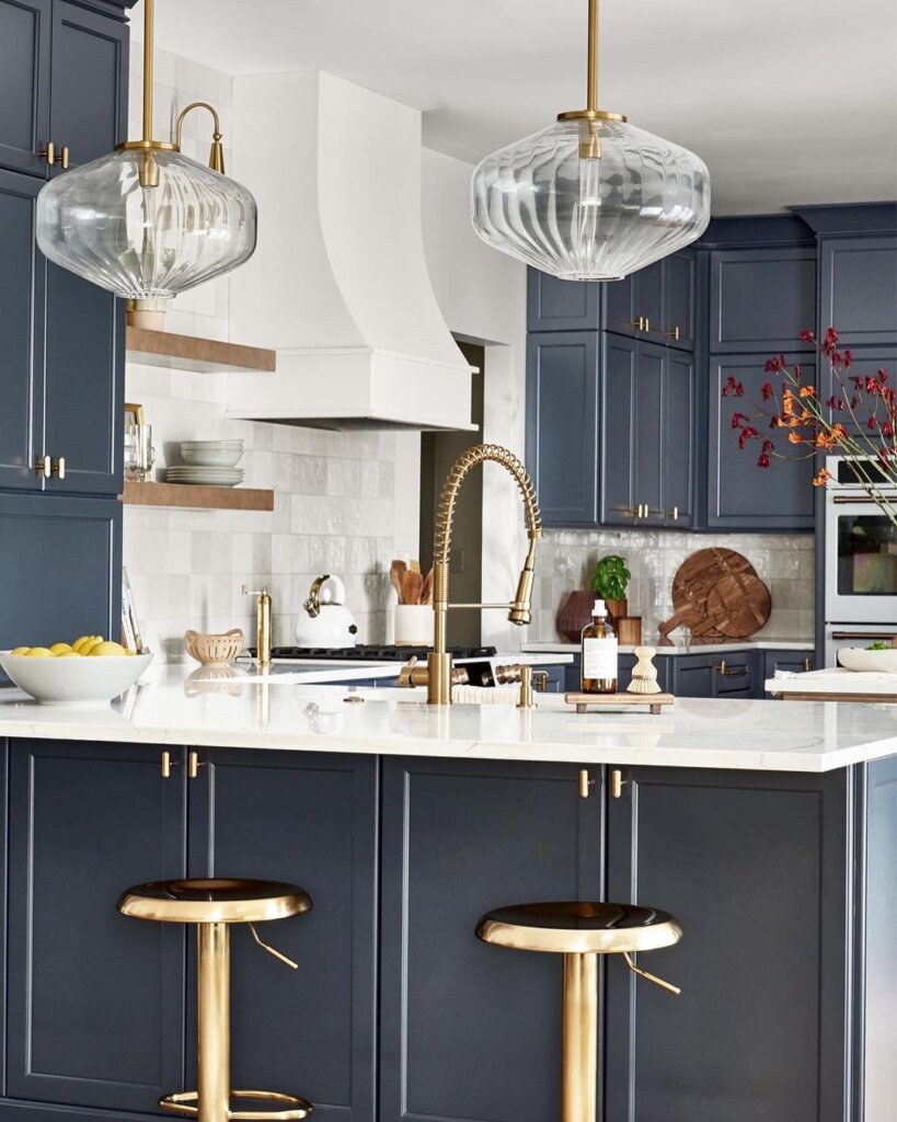
I’m usually an all-white kitchen kind of girl, but I’ve got to say just how brilliant this kitchen remodel turned out! I am in love with the blue cabinets. It adds so much personality to the room.
I especially love the lighting pendent’s shape. They look amazing. The backsplash and the countertops along with the brass accents definitely add a touch of modern style to the mix.
16. BEFORE: SPACIOUS BUT NEEDS AN UPGRADE
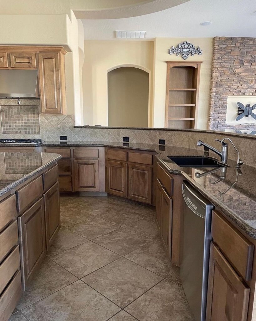
Before it was renovated, the kitchen looked outdated. The cabinet colors along with the tiles and countertop made the space look darker and drab.
AFTER: BRIGHT WHITE KITCHEN
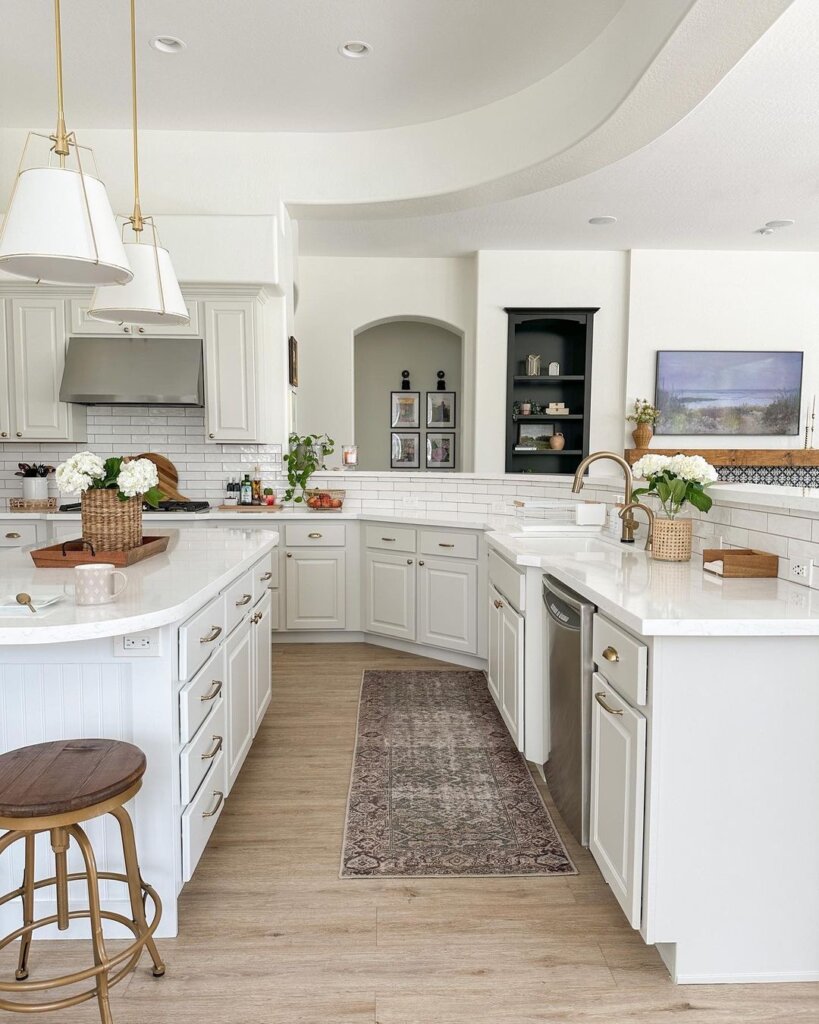
The after-kitchen remodel is out of this world! They kept the same layout but definitely changed quite a bit.
The countertop, the backsplash, the lighting, floors, cabinets, and a few more changes were made. The space looks more luxurious and bright. It’s crazy how simply changing up the cabinet colors can make such a big difference.
Pin for Later

THIS POST SHOWED YOU THE BEST BEFORE AND AFTER KITCHEN REMODEL IDEAS

